



Email preheader call to action examples can transform inbox performance when executed correctly. A preheader CTA is the short preview text that appears after your subject line in most email clients, functioning as a secondary hook to drive opens and set expectations for the click action inside. When optimized properly, preheader CTAs increase both open rates and click-through rates by creating alignment between what readers expect and what they receive.
This guide provides 25+ proven email preheader call to action examples, strategic frameworks, and testing methodologies that convert browsers into clickers.
What Is an Email Preheader Call to Action? (And Why It Matters)

An email preheader call to action is the preview text snippet (typically 40-130 characters) that displays alongside your subject line in the inbox. Unlike traditional CTAs placed inside email body copy, preheader CTAs work at the open stage, functioning as a micro-promise about what action awaits inside.
Quick Answer: Email preheader CTAs are short action-oriented phrases in the preview text that tell subscribers what to do or what they'll gain by opening. They bridge subject lines and in-email content, reducing friction between curiosity and commitment.
Most email clients display preheaders differently:
- Gmail (desktop): ~120 characters
- Outlook: ~50-60 characters
- Apple Mail (iOS): ~70 characters
- Gmail (mobile): ~30-40 characters
The preheader matters because it's prime real estate in visual hierarchy. Research on inbox scanning behavior shows readers process subject line + preheader as a unified decision unit. When your preheader includes a clear call to action or benefit statement, it reduces uncertainty about email value, directly impacting open rates.
More importantly, preheader CTAs set correct expectations. When subscribers know what action you want (claim offer, read tips, register now), they open with intent rather than curiosity. This intent-driven opening correlates strongly with higher email click through rate improvement because the mental gap between opening and clicking shrinks.
How Email Preheader CTAs Improve Click-Through Rates
Preheader CTAs work on psychological principles of commitment and expectation matching. Here's why they drive measurable performance lifts:

- Cognitive priming: When the preheader signals "Click to claim 20% off," readers who open have already mentally committed to clicking, reducing decision fatigue inside the email
- Expectation alignment: Mismatch between preview and content kills CTR; preheader CTAs eliminate surprise, creating a frictionless path from open to click
- Mobile optimization: On mobile devices where subject lines truncate heavily, preheaders carry proportionally more decision weight
- Scannability advantage: Action-oriented language in preheaders helps your email stand out in cluttered inboxes where most brands use generic preview text
- Secondary value proposition: When subject lines lead with urgency or curiosity, preheaders can add the "what's in it for me" component that hesitant openers need
The conversion mechanism is straightforward: better-qualified opens lead to better click-through rates because subscribers enter your email already oriented toward action rather than passive reading.
25 Email Preheader Call to Action Examples That Actually Work
The strongest preheader CTAs match campaign intent with reader psychology. Here are proven examples organized by strategic approach.
Urgency-Based Examples
Urgency-driven preheaders leverage FOMO and deadline psychology:
- "Claim your spot before midnight: Only 47 left"
- "Flash sale ends in 6 hours. Tap to save 40%"
- "Your cart expires at 9pm. Complete checkout now"
- "Early access closes Friday. Reserve your place →"
- "Last chance: Apply code SAVE25 before Sunday"
These work best when urgency is real and verifiable. Fake scarcity kills trust and deliverability long-term.
Curiosity-Driven Examples
Curiosity CTAs withhold just enough information to compel opens:
- "See the #1 mistake in your industry (+ how to fix it)"
- "Open to discover what 87% of teams miss"
- "The surprising reason your emails get ignored inside"
- "Revealed: Why your conversion rate stalled last quarter"
- "One change doubled our response rate. Details inside →"
These examples work because they promise specific value without giving away the full answer, creating an information gap that drives action.
Benefit-Focused High Converting Email CTA Examples
Benefit-forward preheaders lead with tangible value:
- "Get your free template + 12 proven examples"
- "Download the complete 2024 benchmark report"
- "Access 50+ ready-to-use email sequences"
- "Unlock your personalized growth roadmap today"
- "Claim your audit: 15-min video analysis included"
The conversion power here comes from clarity. Readers know exactly what they're clicking for, which pre-qualifies interest and increases in-email engagement.
Personalization-Based CTAs
Personalized preheaders leverage data to increase relevance:
- "Sarah, your custom dashboard is ready to view"
- "Based on your last purchase: Here's 15% off supplements"
- "Your Q4 performance report just arrived. Check insights →"
- "New recommendations based on your Chicago location"
- "Your renewal date is approaching, update preferences now"
Personalization increases perceived value when it references genuine user data or behavior. Generic "first name" insertion without context often underperforms.
Action-Oriented Micro-Commitment CTAs
These preheaders request small, low-friction actions:
- "Take the 2-minute assessment. Get your score instantly"
- "Click to see your savings estimate"
- "Tap to compare pricing for your team size"
- "Update your preferences in one click"
- "Reply YES to confirm your attendance"
Micro-commitments work because they reduce the perceived cost of clicking while maintaining clear action orientation.
Best Email CTA Examples vs Weak Ones (Comparison Table)
Understanding what separates high converting email CTA examples from weak performers requires side-by-side analysis:
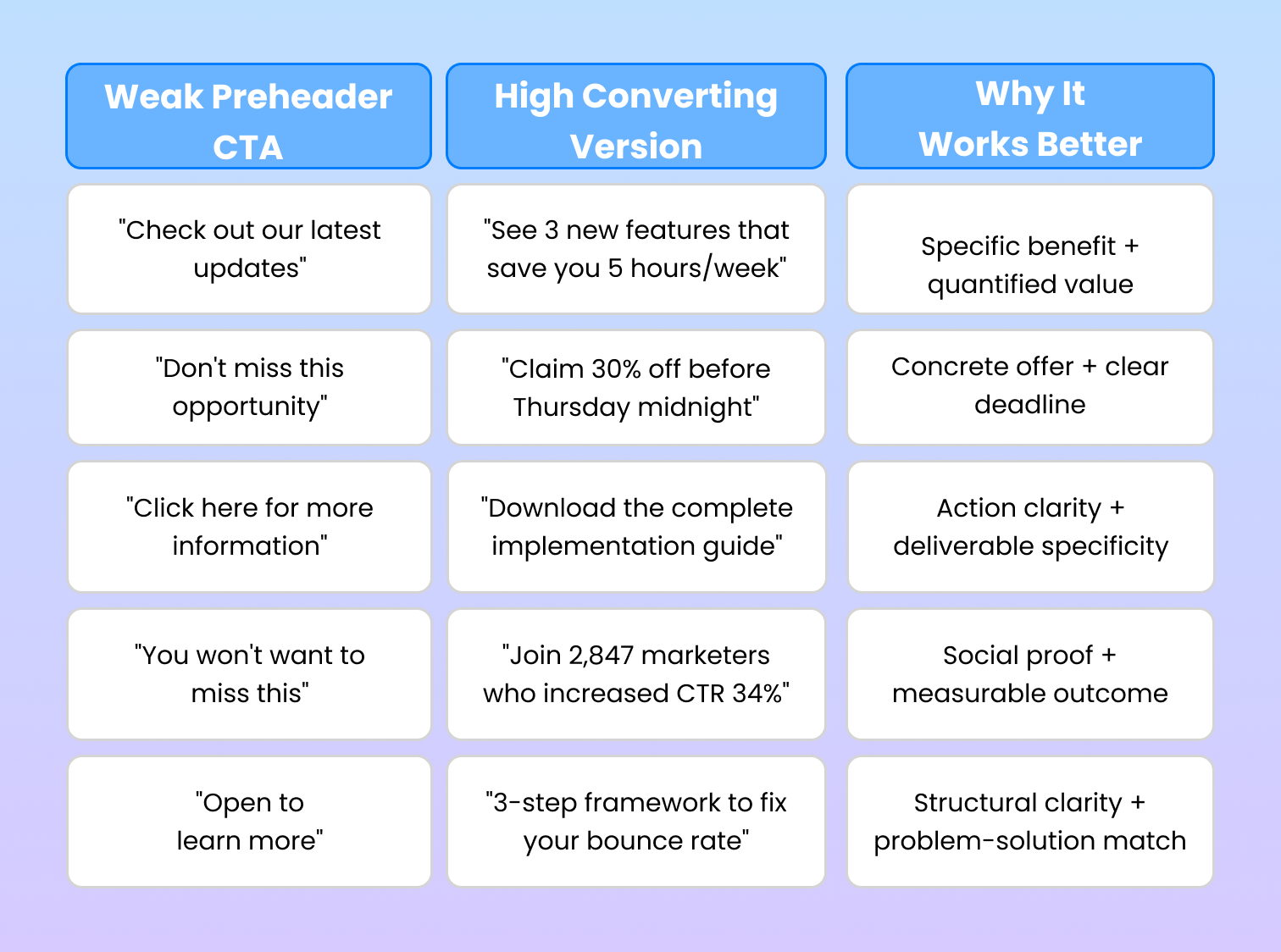
The pattern is consistent: clarity beats cleverness, and benefit beats hype. High converting preheaders answer three questions simultaneously: what action, what benefit, what timeline.
Weak preheaders rely on curiosity without substance or make vague promises. They increase opens from casual scanners but fail to pre-qualify interest, resulting in lower click-through rates from less engaged openers.
How to Write High Converting Email Preheader CTAs
Creating effective preheader CTAs follows a repeatable framework. Here's the strategic approach:
Step 1: Identify the primary conversion goal
Before writing, know whether you're driving opens, clicks, or both. Preheaders optimized purely for open rate may sacrifice CTR if they overpromise.
Step 2: Match preheader intent to in-email CTA
Your preheader should preview the primary action inside. If your email CTA says "Start free trial," your preheader might be "See why 10,000+ companies chose our platform."
Step 3: Choose your psychological trigger
Select from: urgency, scarcity, social proof, benefit specificity, curiosity gap, or personalization. Don't mix more than two triggers in one preheader.
Step 4: Apply proven formulas
Three high-performing structures:

Step 5: Optimize for character limits
Mobile display constraints require strategic editing:
- Primary message in first 40 characters: Mobile Gmail cuts off early
- Complete thought by 70 characters: Safe zone for most iOS mail apps
- Full message by 90 characters: Desktop Gmail threshold
- Maximum 130 characters: Absolute limit before universal truncation
Test how your preheader renders across devices. A CTA that reads perfectly in desktop Outlook but truncates mid-word on mobile Gmail destroys effectiveness.
Step 6: Add action-oriented language
Use verbs that signal low-friction action: get, claim, see, discover, access, unlock, compare, try, join, start. Avoid passive constructions like "available inside" or "can be found here."
Mobile optimization critical: Over 60% of emails are opened on mobile devices. Structure preheaders so the core CTA/benefit comes first, with supporting details afterward.
Email Click Through Rate Improvement: Testing Your Preheader CTAs
Systematic testing separates guessing from optimization. Here's how to structure preheader CTA experiments:
A/B Testing Framework
Split test one variable at a time:
- Urgency vs benefit focus
- Short (40 char) vs medium (80 char) length
- Generic vs personalized language
- CTA-focused vs information-focused
Test on statistically significant samples (minimum 1,000 opens per variant for most campaigns) and run tests through complete send cycles to account for time-zone and day-of-week variables.
Track the Right Metrics
Three measurements matter:
- Open Rate: Did the preheader improve inbox appeal?
- Click-Through Rate (CTR): Are more total recipients clicking?
- Click-to-Open Rate (CTOR): Are openers more likely to click?
CTOR is critical for preheader evaluation. If a new preheader increases opens but CTOR drops, you've attracted less qualified opens. The goal is simultaneous improvement in both open rate and CTOR.
List Quality Affects Everything
Even brilliant preheader CTAs fail on degraded lists. Unengaged subscribers, spam traps, and invalid addresses suppress deliverability, ensuring your preheaders never reach engaged inboxes.
This is where email verification infrastructure matters. Services like VitaMail maintain list hygiene by validating email addresses before sending, ensuring your optimized preheaders reach real, active subscribers rather than bouncing or landing in spam folders. Clean lists create the foundation for reliable CTA testing and performance measurement.
Segmentation Testing
Test preheader variations across segments:
- New subscribers vs long-term engaged
- Mobile vs desktop openers
- High-value vs casual customers
- Geographic or industry segments
Different audiences respond to different psychological triggers. What works for enterprise B2B may underperform in DTC ecommerce contexts.
Effective Email CTA Buttons vs Preheader CTAs: What's the Difference?
Preheader CTAs and in-email CTA buttons serve different conversion stages and require different strategic approaches:

Preheader CTAs function as open triggers. They work at the decision point between "ignore this email" and "open to see more." The conversion goal is to move subscribers from inbox to message view. Success is measured in open rate improvement and CTOR alignment.
In-email CTA buttons function as click triggers. They work after the open decision, when subscribers are evaluating whether to take action on your offer. The conversion goal is moving from message view to destination (landing page, product page, registration form). Success is measured in click-through rate and downstream conversion.
The strategic alignment between them determines overall campaign performance. Consider these example pairings:
Webinar Campaign:
- Preheader CTA: "Save your seat for Thursday's live training →"
- In-email CTA button: "Register Now – Secure My Spot"
Product Launch:
- Preheader CTA: "Early access starts now. See the new features"
- In-email CTA button: "Explore the Platform"
Content Marketing:
- Preheader CTA: "Get the complete SEO checklist + templates"
- In-email CTA button: "Download the Free Guide"
Notice how preheaders preview the value while in-email CTAs drive completion. The language shifts from "see" and "discover" in preheaders to "get," "start," and "claim" in buttons.
Misalignment between preheader and in-email CTAs creates drop-off. If your preheader promises "instant access to the report" but your email CTA says "learn more," you've introduced friction between expectation and delivery.
Email Marketing Call to Action Ideas by Campaign Type
Different campaign objectives require different preheader CTA approaches. Here are proven email marketing call to action ideas by vertical:
SaaS
- "Start your 14-day trial (no credit card required)"
- "See how [Company] increased efficiency 40% (case study inside)"
- "Compare plans for teams of 5, 20, or 100+"
- "Your account is ready. Complete setup in 3 minutes"
- "Join the product roadmap preview session Thursday"
Ecommerce
- "Get 25% off your first order + free shipping today"
- "Your saved items just dropped in price. Check cart →"
- "New arrivals: Shop the collection before it sells out"
- "Exclusive early access for email subscribers starts now"
- "Complete your look: Recommended based on your recent purchase"
Webinar/Event
- "Register now—only 80 seats left for live Q&A"
- "Get the agenda + speaker lineup for next week's summit"
- "Watch on-demand: The recording is available for 72 hours"
- "Your calendar invite is attached. Add to Google/Outlook"
- "Submit your questions before Thursday's panel discussion"
Newsletter/Content
- "This week: 5 strategies to improve your conversion rate"
- "Most popular: The article 12,000+ readers shared this month"
- "Get the printable version + bonus templates"
- "Poll results are in. See where your answer ranked"
- "Quick read: 3 minutes to understand the new algorithm update"
B2B Lead Generation
- "Download the 2024 industry benchmark report"
- "Calculate your potential ROI with our savings estimator"
- "Request your custom demo. See it work with your data"
- "Get the buyer's guide: 47 pages of vendor comparisons"
- "Book your free audit—30-min strategy call included"
Each example addresses specific conversion barriers in that campaign context. SaaS preheaders reduce trial friction, ecommerce versions drive purchase urgency, B2B examples emphasize value proof and low-commitment next steps.
Common Mistakes That Kill Preheader Performance
Avoid these preheader CTA errors that destroy open and click-through rates:
- Using generic placeholder text: Default "View in browser" or "Trouble reading this email?" wastes valuable preview space and signals low-effort campaigns
- Repeating the subject line verbatim: This redundancy provides no additional information and reduces the total message impact in inbox preview
- Writing for desktop only: Testing exclusively in desktop email clients misses mobile truncation issues that affect the majority of opens
- Overpromising value: Creating expectation gaps between preheader claims and actual email content increases unsubscribes and spam complaints
- Ignoring character limits: Preheaders that truncate mid-sentence or mid-word appear unprofessional and confuse scanning readers
- Forgetting preheader exists: Leaving preheader content to default pulls ugly HTML code snippets into inbox preview
- Mixing too many concepts: Trying to communicate urgency + social proof + benefit + personalization in one preheader creates cognitive overload
- Using all caps or excessive punctuation: "OPEN NOW!!!" triggers spam filters and signals desperation rather than value
- Including unsubscribe links: Your preheader should sell the open, not facilitate the exit
- Testing too many variables simultaneously: Changing subject line, preheader, send time, and from-name in one test makes attribution impossible
The most damaging mistake is treating preheaders as an afterthought. In inbox environments where subject lines increasingly look similar, preheader text is often the tiebreaker that determines whether your email gets opened or ignored.
Final Checklist: Email Preheader CTA Optimization
Before sending your next campaign, verify these preheader CTA essentials:
✓ Preheader contains clear action language or specific benefit statement
✓ Length stays under 130 characters with core message in first 40 characters
✓ No repetition of exact subject line wording
✓ Message renders correctly on mobile Gmail, iOS Mail, and Outlook
✓ Preheader aligns with primary in-email CTA and campaign goal
✓ Psychological trigger matches audience segment and campaign type
✓ No placeholder text, HTML code, or unsubscribe links visible
✓ A/B test planned with single variable isolation
✓ Success metrics defined (open rate, CTR, CTOR targets)
✓ List quality verified and invalid addresses removed
Consistent application of this checklist transforms preheader CTAs from ignored preview text into strategic conversion tools that measurably improve campaign ROI.
Conclusion
Email preheader call to action examples demonstrate a fundamental truth about inbox optimization: small, strategic changes create disproportionate performance improvements. The 40-130 characters of preview text represent some of the highest-leverage real estate in your entire email marketing infrastructure.
The difference between generic preheader text and optimized CTAs is measurable. Campaigns with benefit-specific, action-oriented preheaders consistently show 8-20% higher click-to-open rates because they attract subscribers who enter emails already oriented toward action rather than passive browsing.
List quality remains the foundation. Even perfectly crafted preheader CTAs fail when emails never reach active inboxes due to poor deliverability. This is where email verification infrastructure like VitaMail provides essential support, maintaining list hygiene ensures your optimization work reaches real subscribers rather than bouncing to invalid addresses or landing in spam folders.
The path forward is clear: audit your current preheader strategy, implement the frameworks and examples outlined here, and commit to continuous testing. The conversion improvements aren't theoretical, they're mechanical results of better inbox decision-making by your subscribers.