
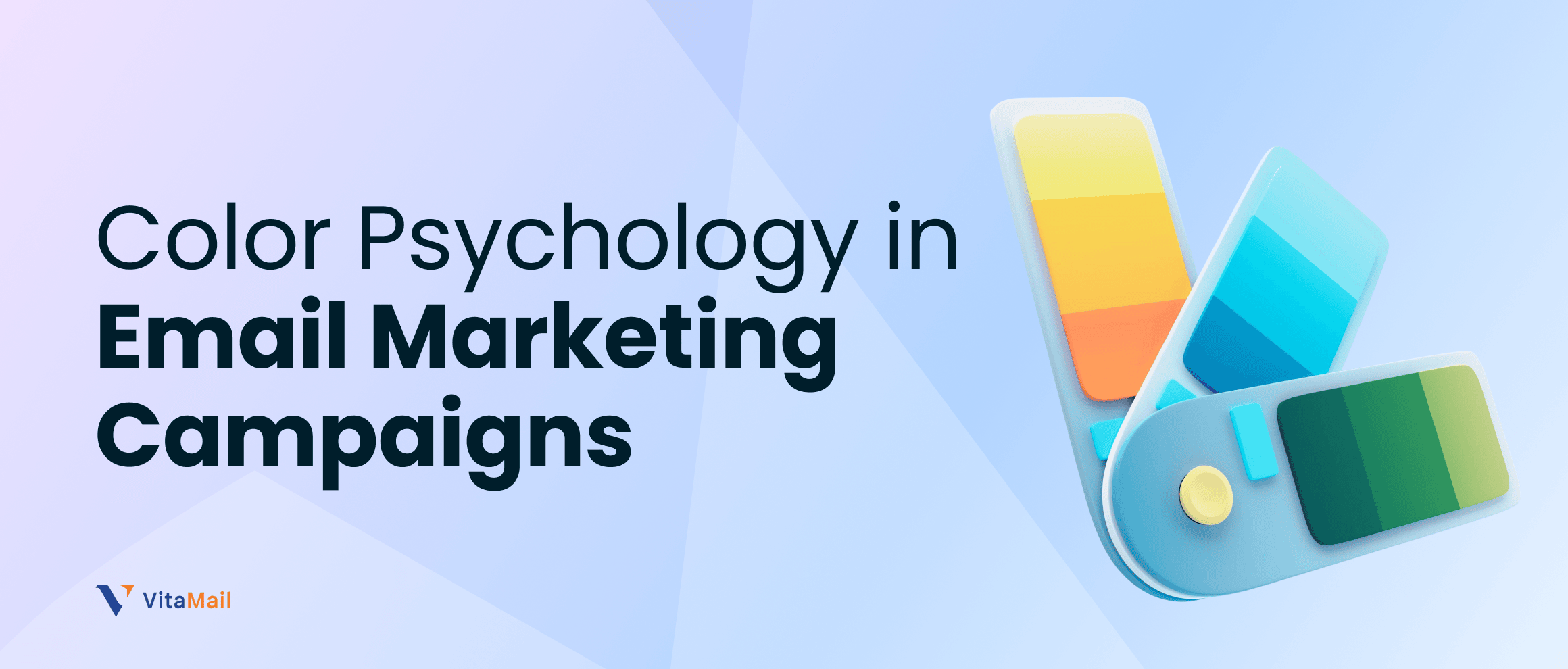


When you receive an email in your inbox, your brain makes a decision about it in just 50 milliseconds. In that tiny fraction of a second, colors play a disproportionately large role in whether you open it, engage with it, or delete it. This is the power of color psychology in email marketing campaigns a subtle but incredibly effective force that separates high-performing campaigns from those that get ignored.
Color psychology isn't magic, but it often feels that way. The right color for a call-to-action button can increase clicks by 21%. The wrong color palette can make your brand look unprofessional or untrustworthy. When you understand color psychology and apply it strategically to your email marketing campaigns, you transform a fundamental design element into a conversion machine.
What is Color Psychology?
Before diving into specific color applications, it's important to understand the foundation: what exactly is color psychology and why does it matter?
Understanding Color Psychology
Color psychology is the study of how colors influence human behavior, emotion, and decision-making. Every color carries psychological weight. Red triggers urgency and excitement. Blue conveys trust and professionalism. Green signals growth and permission. These associations aren't random they're deeply rooted in human psychology, evolution, and cultural conditioning.
In color psychology, each hue (the specific shade of color), saturation (intensity), and brightness all influence perception. A bright, saturated red feels more urgent than a muted, desaturated red. A deep blue feels more professional than a light blue. Understanding these nuances is crucial for effective email design.
Types of Color Psychology in Email Marketing Campaigns
Understanding the types of color psychology at play in email marketing campaigns helps you make strategic choices. There's not just one type of color psychology; several psychological principles work together to influence subscriber behavior.
Emotional Color Psychology
Every color triggers specific emotional responses. When you understand emotional color psychology, you can choose colors that reinforce your message:
Red: Emotion = Urgency, Passion, Excitement Red is the color of urgency. It's used in "limited time" and "act now" messaging because it creates a sense of immediacy. In email marketing campaigns, red works well for:

- Flash sales and limited-time offers
- Promotional campaigns with deadlines
- "Urgent action needed" messages
- High-energy campaigns targeting quick decisions
However, overusing red can feel aggressive. Use it strategically for emphasis and urgency, not for entire email backgrounds.
Orange: Emotion = Enthusiasm, Friendliness, Affordability Orange bridges the gap between red's urgency and yellow's optimism. It feels more approachable than red while still conveying energy. Orange CTAs perform exceptionally well in email marketing campaigns, often outperforming other colors.

- Call-to-action buttons
- Promotional offers and discounts
- Friendly onboarding emails
- Limited-time campaigns without aggressive pressure
Green: Emotion = Trust, Growth, Permission Green is associated with nature, growth, and "go" (traffic lights). In email marketing campaigns, green conveys trust and positive action. It's perfect for:

- Confirmation and approval messages
- Growth-related campaigns
- Sustainability and eco-friendly messaging
- Permission-based actions ("Click to subscribe")
Blue: Emotion = Trust, Professionalism, Calm Blue is the most popular color in business because it conveys trust and stability. B2B email marketing campaigns frequently use blue because it feels professional and serious. Blue works well for:

- Corporate and professional communications
- Financial and banking emails
- Educational content
- Trust-building campaigns
Yellow: Emotion = Optimism, Attention, Caution Yellow is attention-grabbing but can be overwhelming in large doses. It's best used as an accent color to draw attention to specific elements. Use yellow for CTAs that need to stand out, especially in educational or optimistic campaigns.

- Announcements and updates
- Educational or informational emails
- Welcome emails and brand storytelling
- Light promotional messages
Purple: Emotion = Luxury, Creativity, Sophistication Purple conveys premium quality and creativity. It's less common in email marketing campaigns, which makes it distinctive. Use purple for:

- Luxury product campaigns
- Creative and artistic brands
- Premium subscription offerings
- Exclusive membership campaigns
Black: Emotion = Power, Sophistication, Formality Black conveys authority and sophistication. It's often used as a secondary color in email design (text, borders) rather than as a primary color. Black works well for:

- Luxury brand communications
- Formal announcements
- High-end product launches
- Sophisticated brand positioning
White: Emotion = Clarity, Simplicity, Cleanliness White space is one of the most underutilized tools in email design. White (or empty space) creates clarity and makes content more readable. Strategic white space improves the overall feeling of an email.

- Clean, minimalist email layouts
- Product or feature-focused emails
- Professional and corporate messaging
- Building trust through clear communication
Psychological Color Associations
Beyond emotions, colors carry specific associations that impact how subscribers perceive your message:
Safety and Risk: Green signals safety and "go ahead." Red signals caution and potential risk. When asking subscribers to take action, these associations matter.
Price Perception: The color orange is associated with affordability and deals. Blue is associated with premium pricing. The same product can feel cheaper or more expensive based on its color presentation.
Cultural Associations: Color psychology isn't universal. Red means luck and prosperity in China but can mean danger or debt in Western contexts. When targeting international audiences, research color meanings in different cultures.Related Topic: Color psychology in email marketing goes beyond aesthetics and plays a direct role in how consumers perceive and respond to messages. For a deeper academic perspective, How Visual Elements Affect Consumer Perception explores how visual elements influence consumer decision-making.
The Importance of Color Psychology in Email Marketing Campaigns
Now that you understand the types of color psychology, let's discuss the concrete impact: why is color psychology so important for your email marketing campaigns?
Color Psychology Directly Impacts Key Metrics
The importance of color psychology in email marketing campaigns becomes clear when you look at hard data. Color affects the metrics that matter most to email marketers:
Click-Through Rate (CTR)
This is where color psychology's impact is most dramatic. Multiple studies show that CTA button color directly influences CTR:
- Green and orange CTAs outperform red by approximately 21%
- Contrasting button colors increase CTR by 15-30% compared to low-contrast buttons
- Buttons that pop visually (high saturation, contrast) see 34% higher click rates
- Color consistency across campaigns improves CTR by 20% as subscribers learn to recognize your brand's call-to-action style
In practical terms: If you're sending campaigns to 10,000 subscribers with a baseline 2% CTR (200 clicks), changing your button color from red to green could generate approximately 50 additional clicks. Over dozens of campaigns per year, that's thousands of additional interactions.
Open Rates
Color in the preview or subject line area can influence open rates, though the impact is more subtle than with CTAs:
- Colored backgrounds that match brand colors slightly increase opens (2-5%) because they feel more intentional and branded
- Logo visibility (typically includes brand colors) in the preview increases opens by 3-8%
- Consistency in color across campaigns builds recognition, leading to 10-15% higher opens over time
Conversion Rates
While CTAs and buttons are the most direct color influence, overall color psychology impacts conversions:
- Trustworthy color palettes increase conversion by 10-25% in welcome and educational campaigns
- Urgent colors (red/orange) in limited-time campaigns increase conversions by 15-30%
- Professional color presentation increases conversion by 5-15% simply by making the email feel more legitimate
Conclusion
Color psychology is not a luxury in modern email marketing, it's a necessity. Every color choice impacts whether subscribers open your email, click your CTAs, and convert.